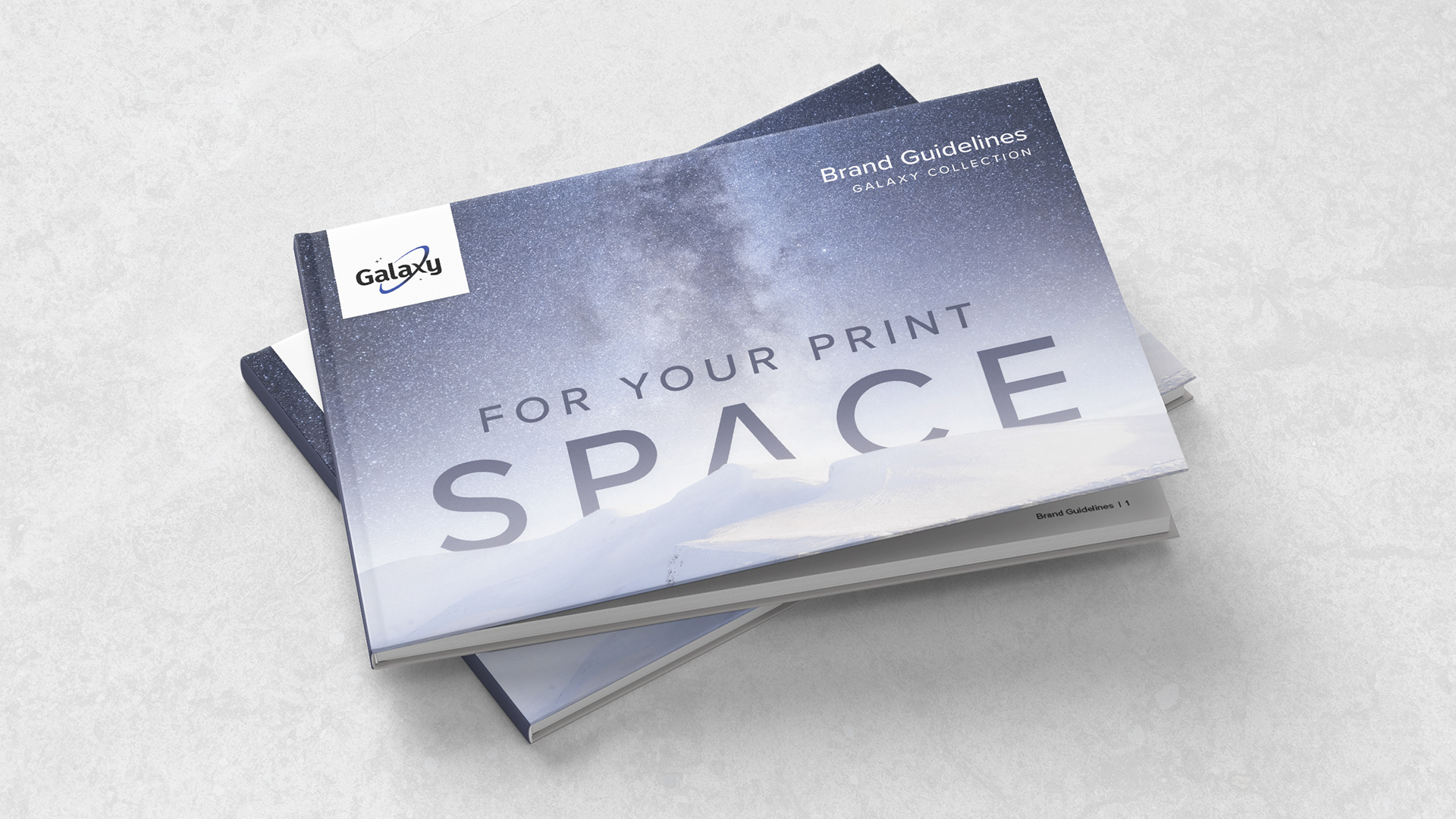
Project
With a recently refreshed logo under their belt and new products added to the collection, Galaxy™ was in need of brand guidelines to consider the re-brand complete (see previous post here).
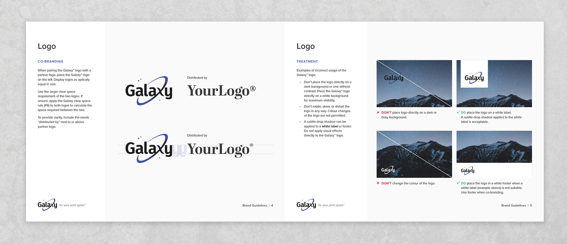
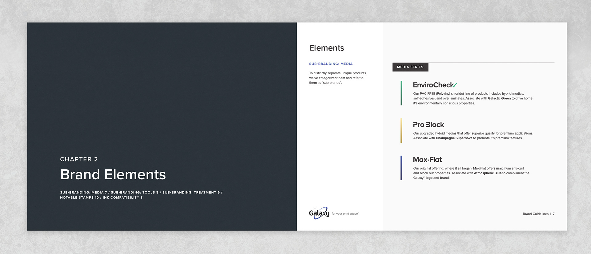
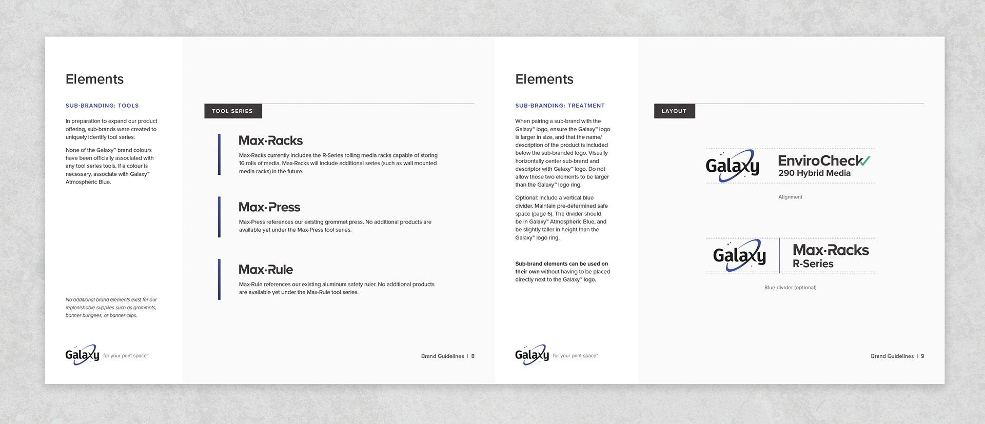
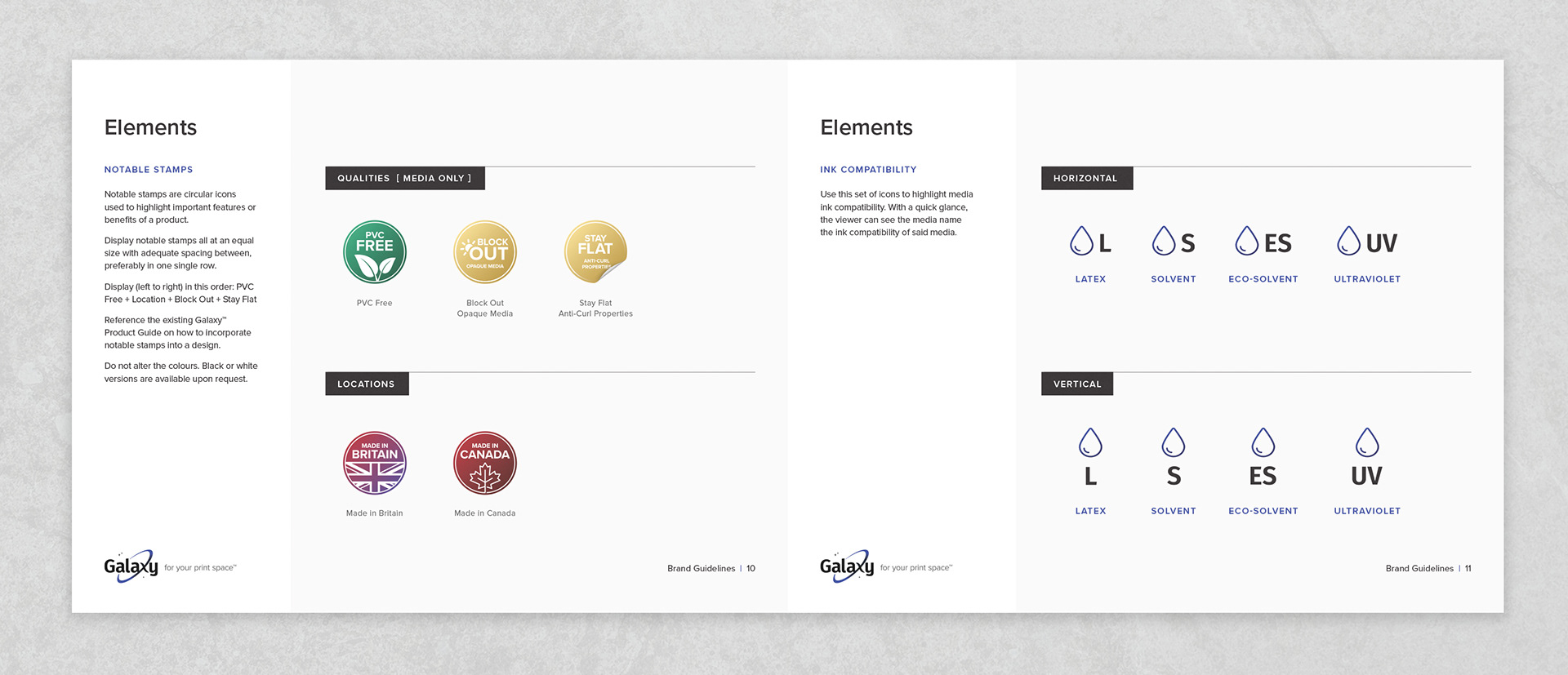
Brand guidelines, or brand books, are intended to provide guidance to those who are creating assets on behalf of Galaxy™, a rule book one could say. Maintaining a consistent image helps to ensure brand recognition and builds trust with customers over time.
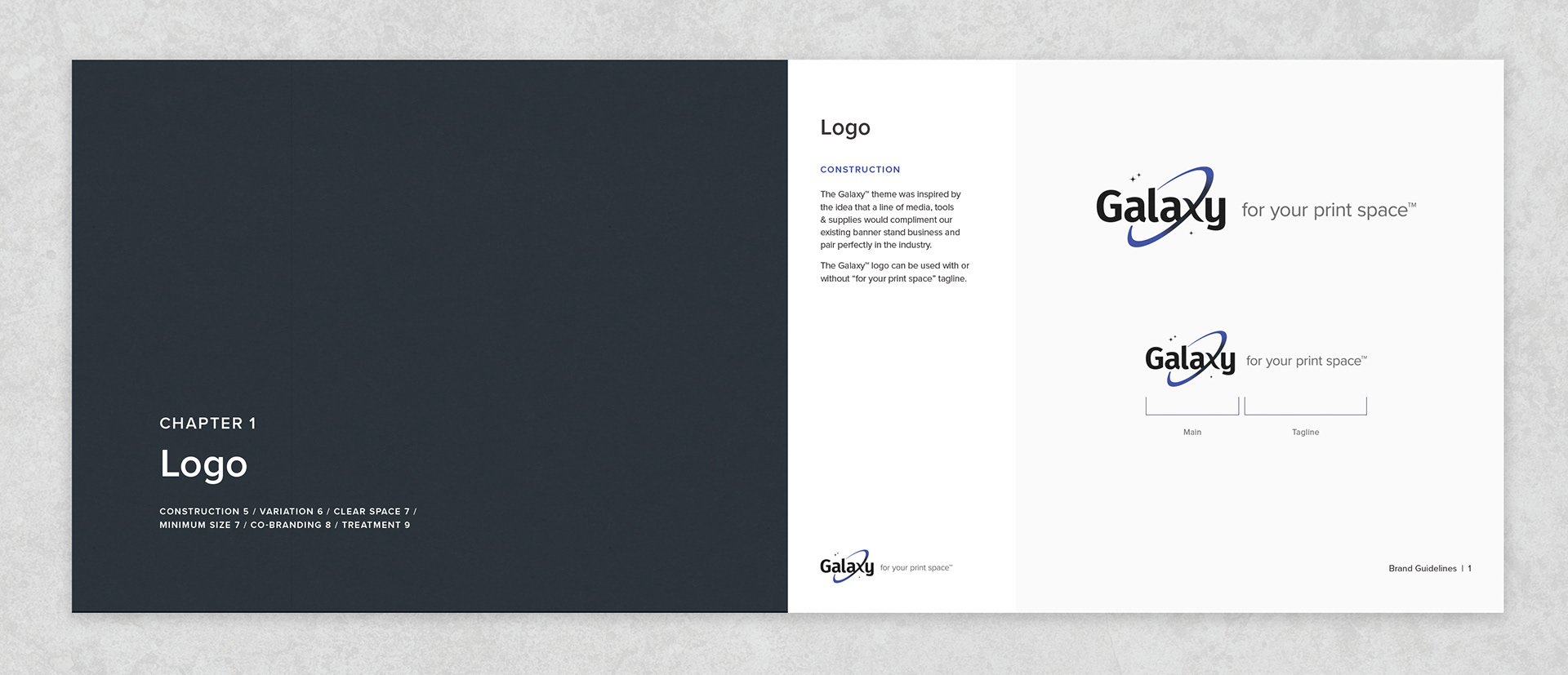
Brand Position
Galaxy™ is a brand created by Frontline to distinguish their line of media from their line of wide format hardware. Contrary to the name, Frontline is never actually at the forefront. The business is built on partnerships with those in the wide format industry. For a select few of distributors, Frontline rebrands their line of wide format hardware to look like a custom house-brand.
However, Galaxy™ was not created with the intent to be rebranded, and this is noted on the inside cover. Galaxy™ is to remain as such in all aspects. With a goal to build a name and reputation of it's own in the wide format space, outlining clear brand guidelines was imperative.
Spotlight
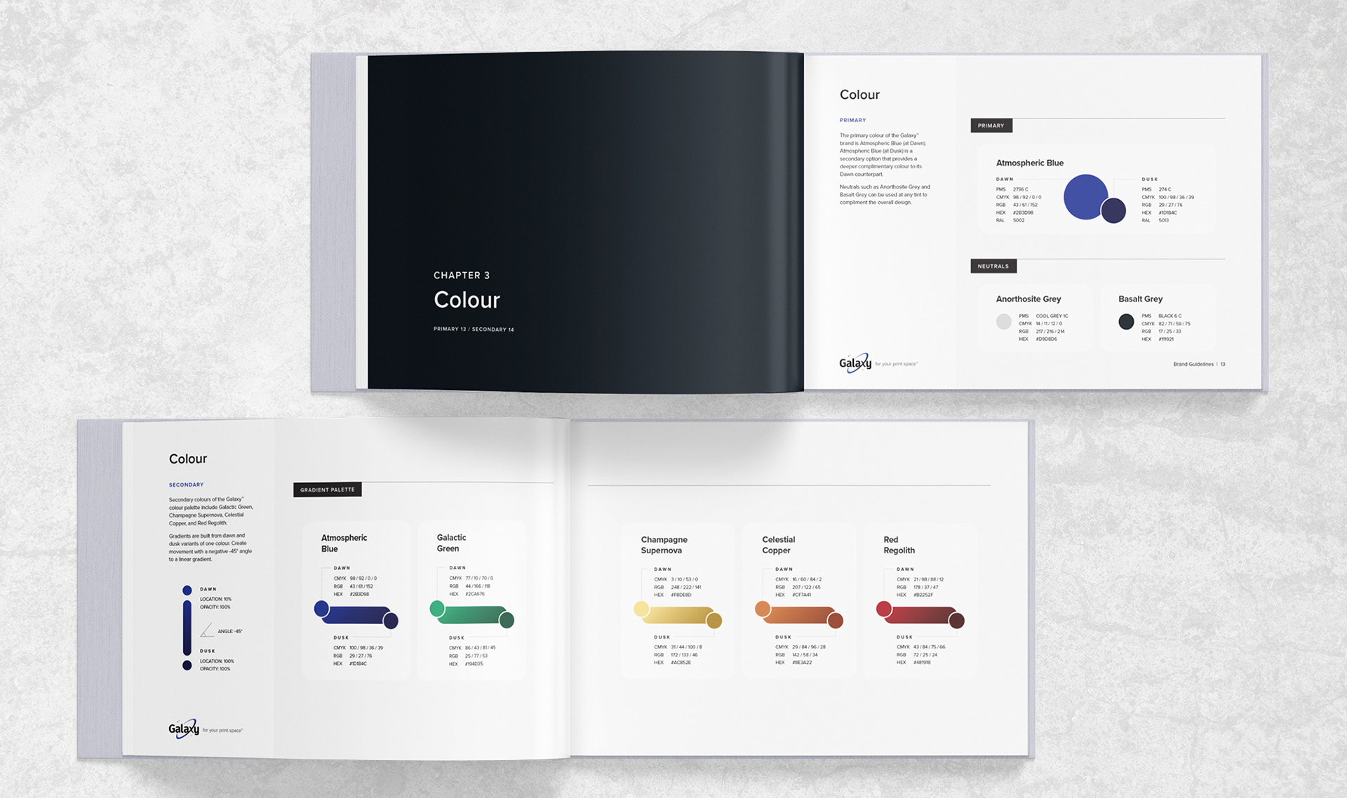
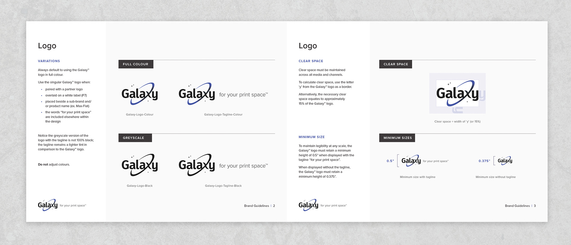
With so many templates available today with the click of a mouse, I wanted to create something new that still worked for it's original purpose. I spent countless hours working through every possible idea that didn’t work and after spending more time than I care to admit, the end result is something I am actually proud of.
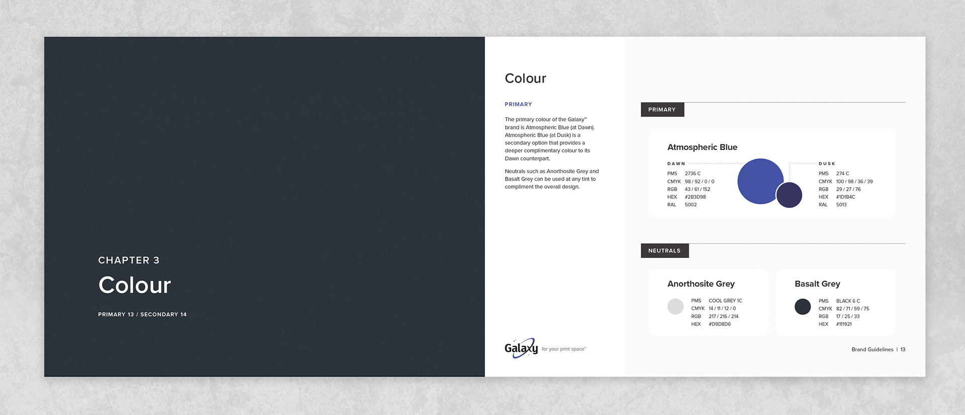
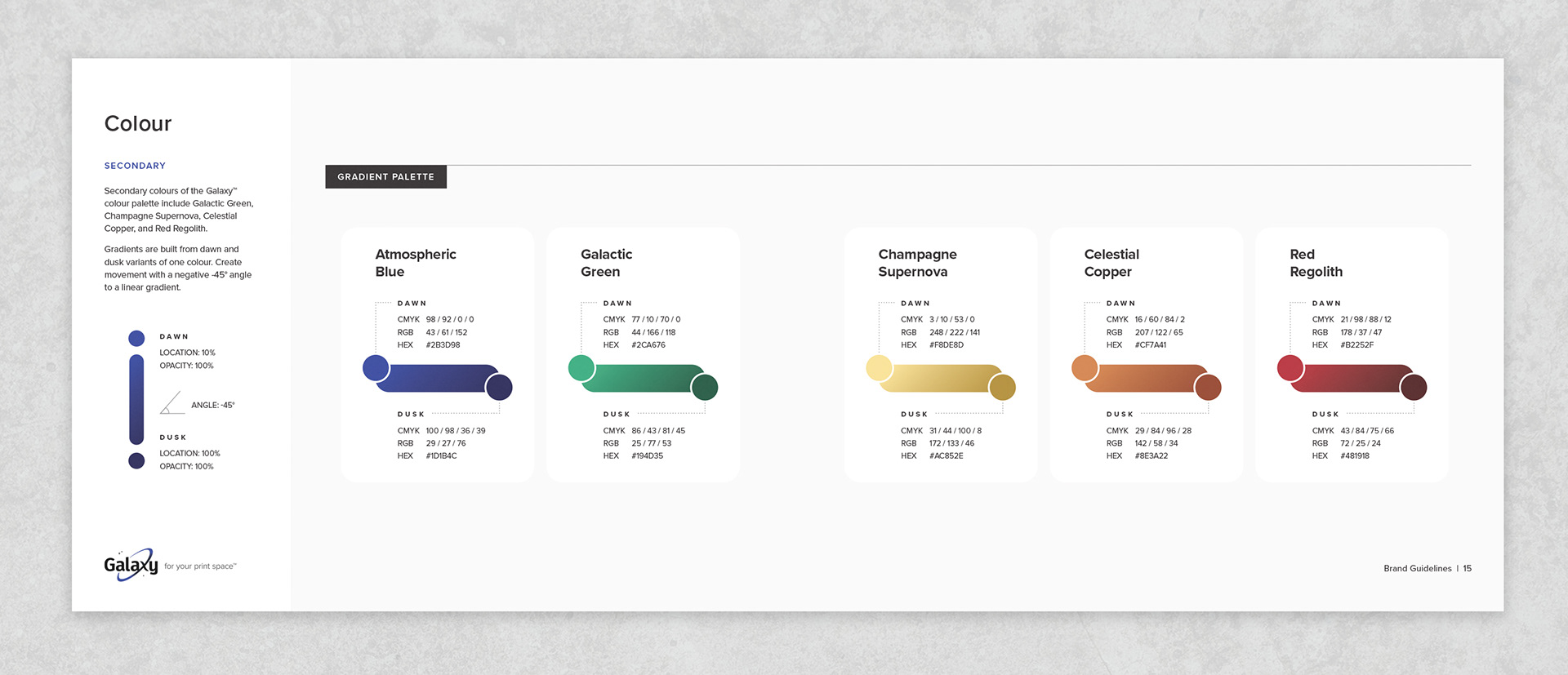
From the start I knew that I would need to create a primary and secondary colour palette because of the number of colours in play. Originally I had searched for suitable space-themed names for each individual colour. After further consideration, I consolidated the idea into labelling the variants 'Dawn' and 'Dusk'. This allowed me sort the colours into groups, simplify the amount of information on each page, and left room to incorporate instructions for creating gradients.