E N E R G Y
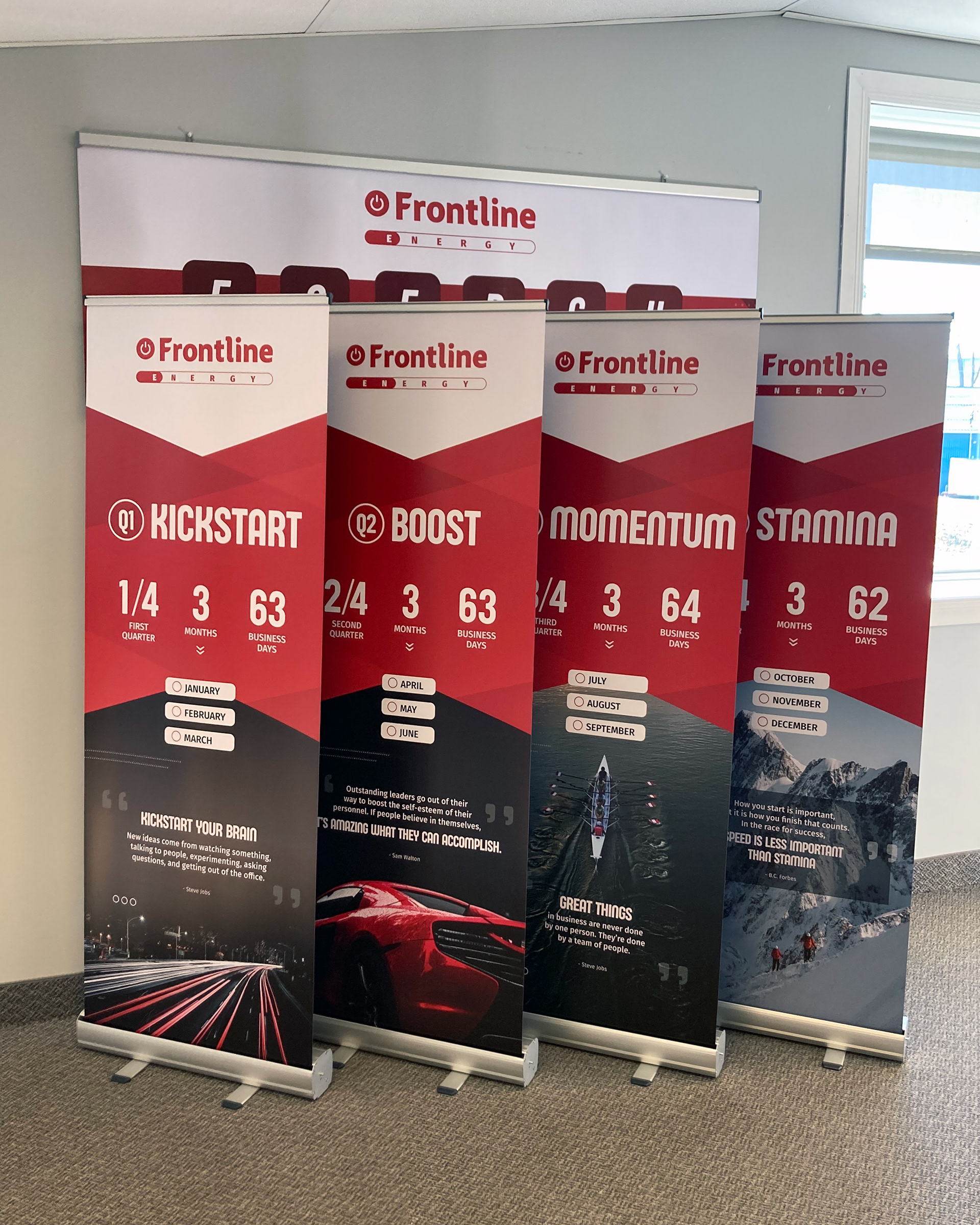
The first annual theme was 'ENERGY', with the following sub-themes for each quarter:
Q1) Kickstart
Q2) Boost
Q3) Momentum
Q4) Stamina
Q2) Boost
Q3) Momentum
Q4) Stamina
I was tasked with creating a logo for 'ENERGY' theme. After exploring a few ideas, we went with an adaption of the company logo, replacing the icon before the Frontline name with a power button. The bar beneath that is similar to a loading bar; it fills as the year progresses in reference to time passing, reaching sales targets, and achieving our goals.
Additionally I designed four banners, one for each quarter. It was requested that each design contain the logo and quarterly sub-theme, presented in a way to inspire staff each day. I scoured the web for a few inspirational team building quotes that also tie back to the quarterly sub-theme.
As a little bonus, I included checkboxes beside each month so the team could mark them as "complete" when the month came to a close, slowly counting down to the end of the year.
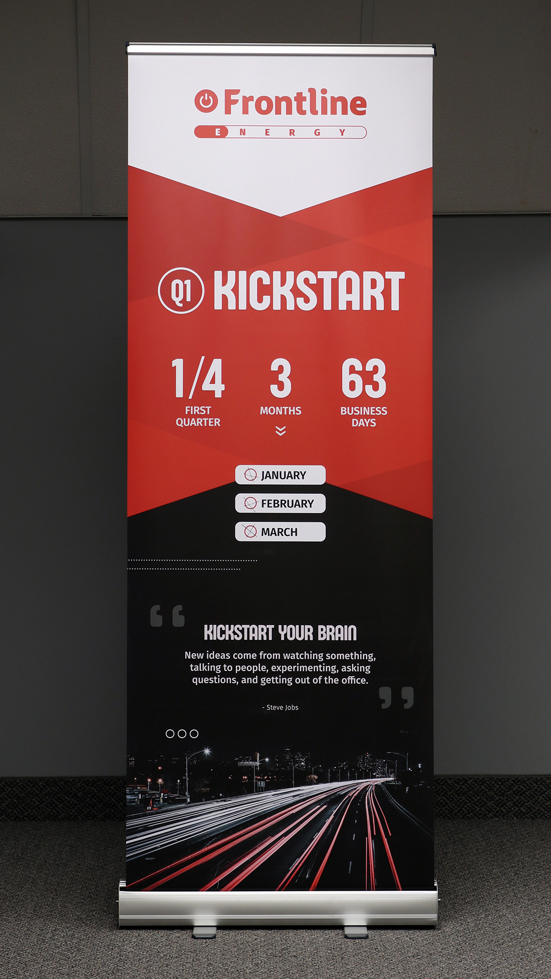
"Kickstart your brain. New ideas come from watching something, talking to people, experimenting, asking questions, and getting out of the office." Steve Jobs
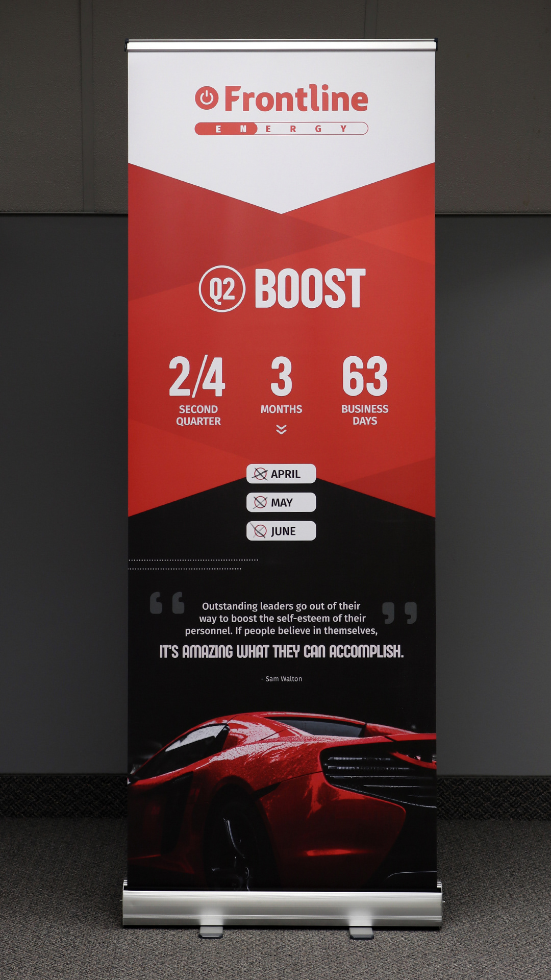
"Outstanding leaders go out of their way to boost the self-esteem of their personnel. If people believe in themselves, it's amazing what they can accomplish." Sam Walton
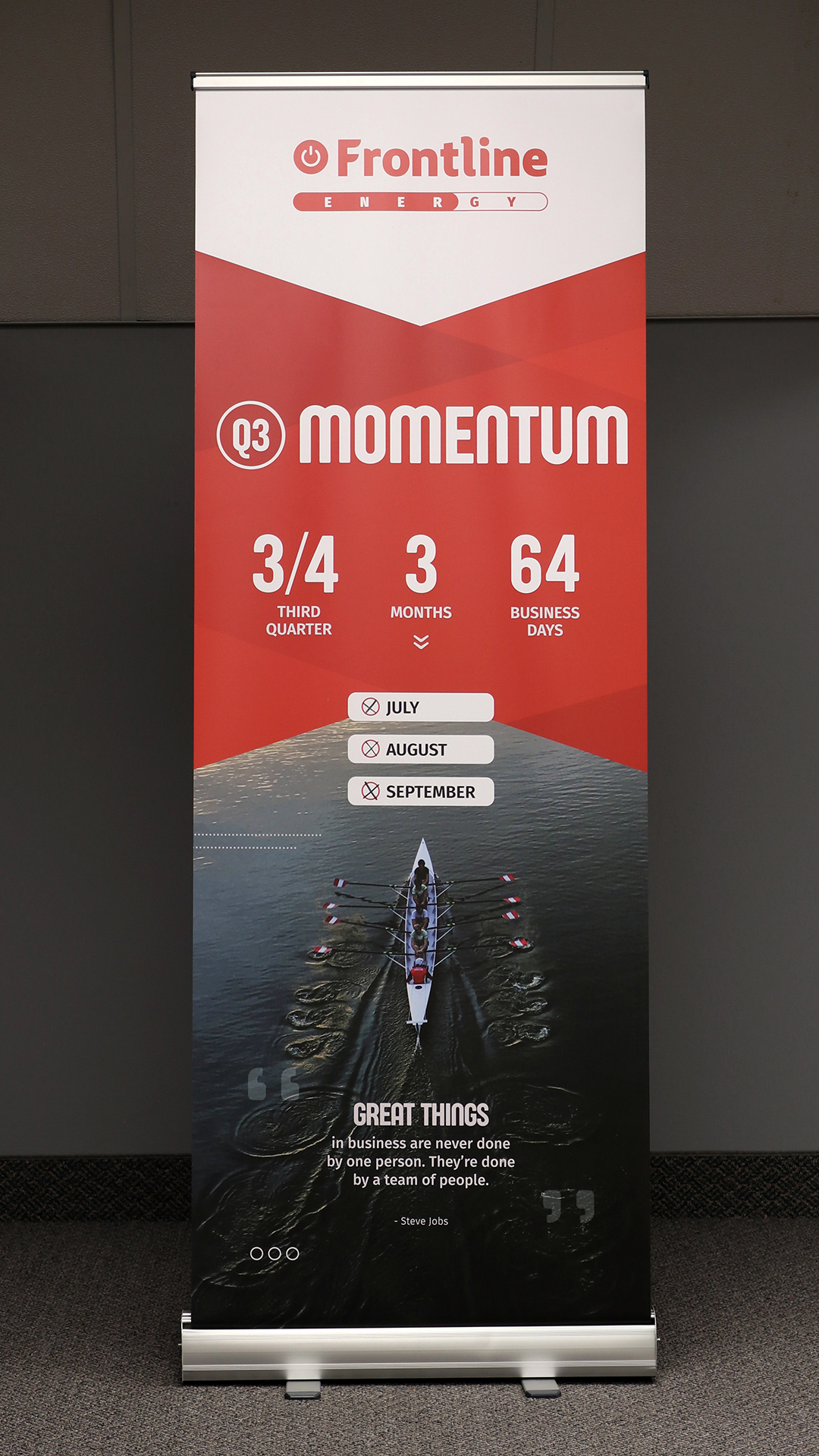
"Great things in business are never done by one person. They're done by a team of people." Steve Jobs
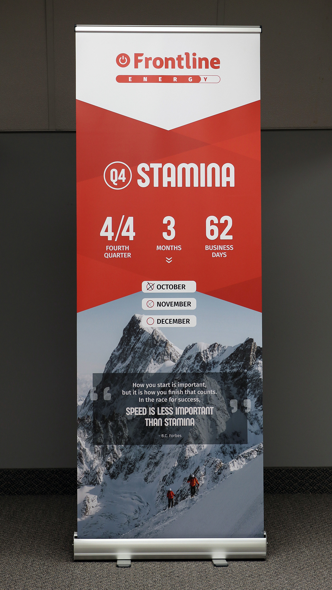
"How you start is important, but it is how you finish that counts. In the race for success, speed is less important than stamina." B.C. Forbes
A L T I T U D E
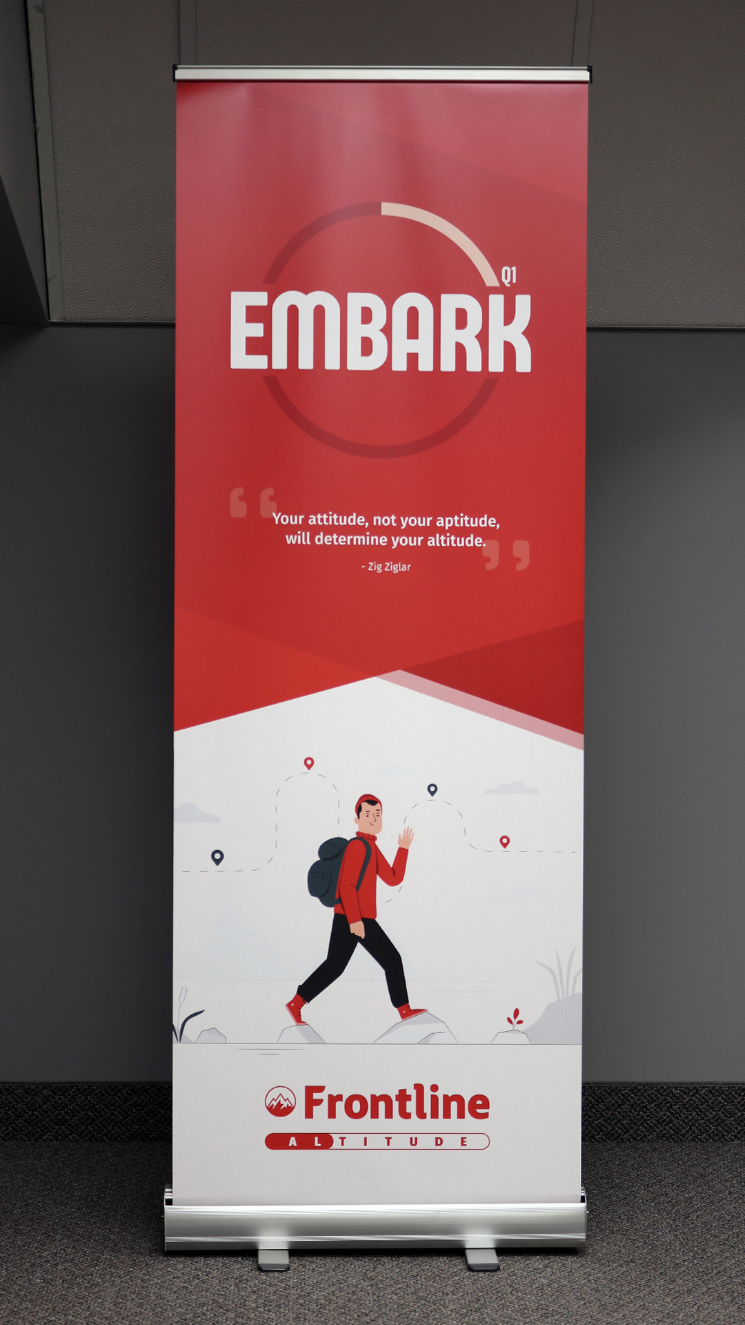
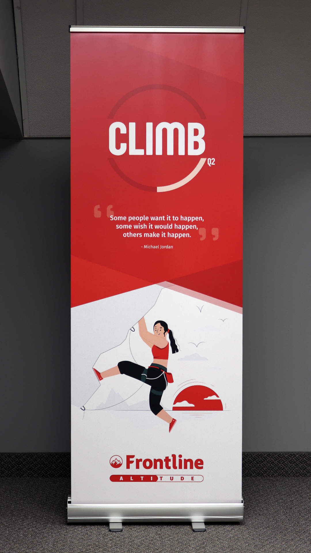
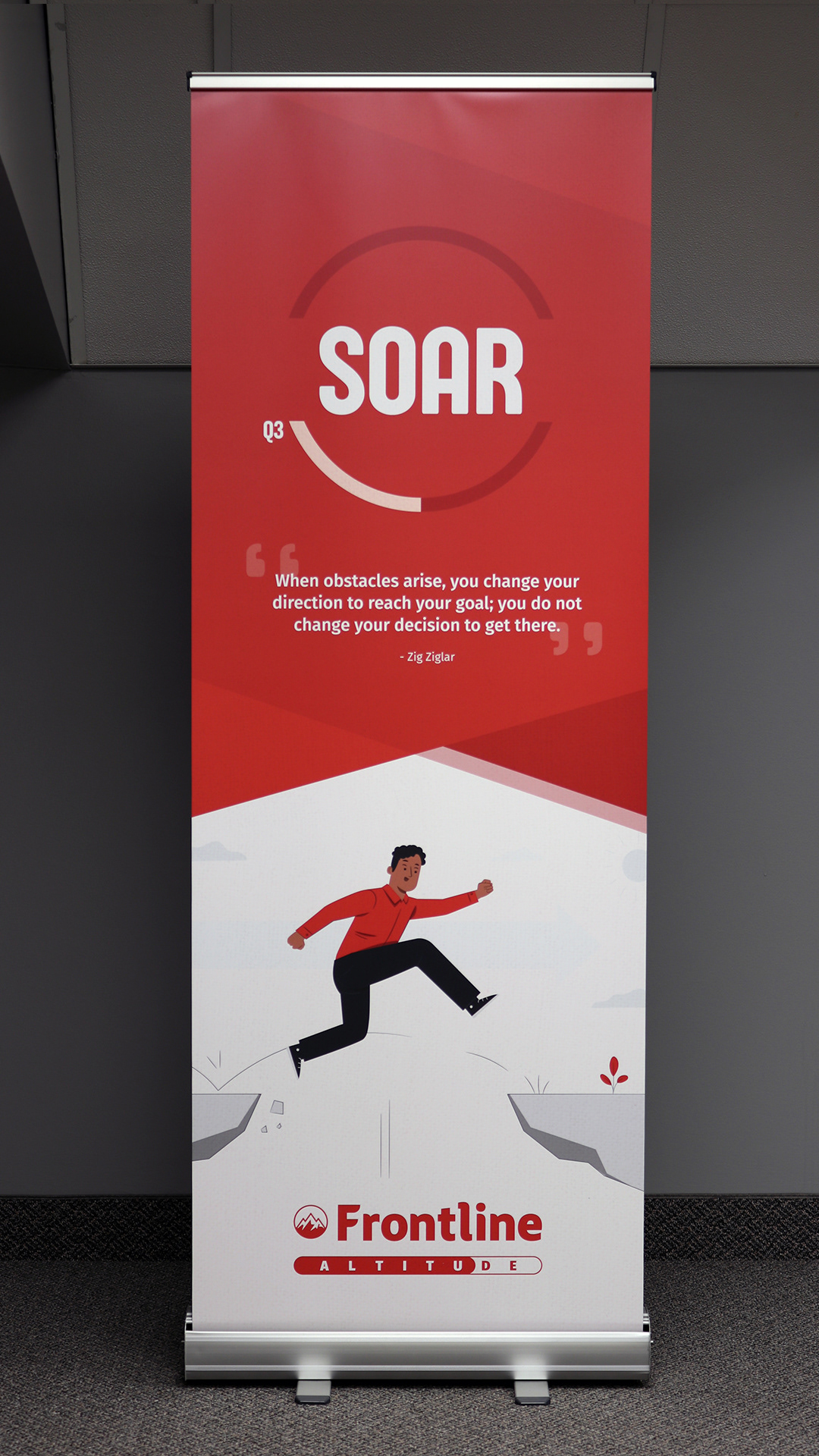
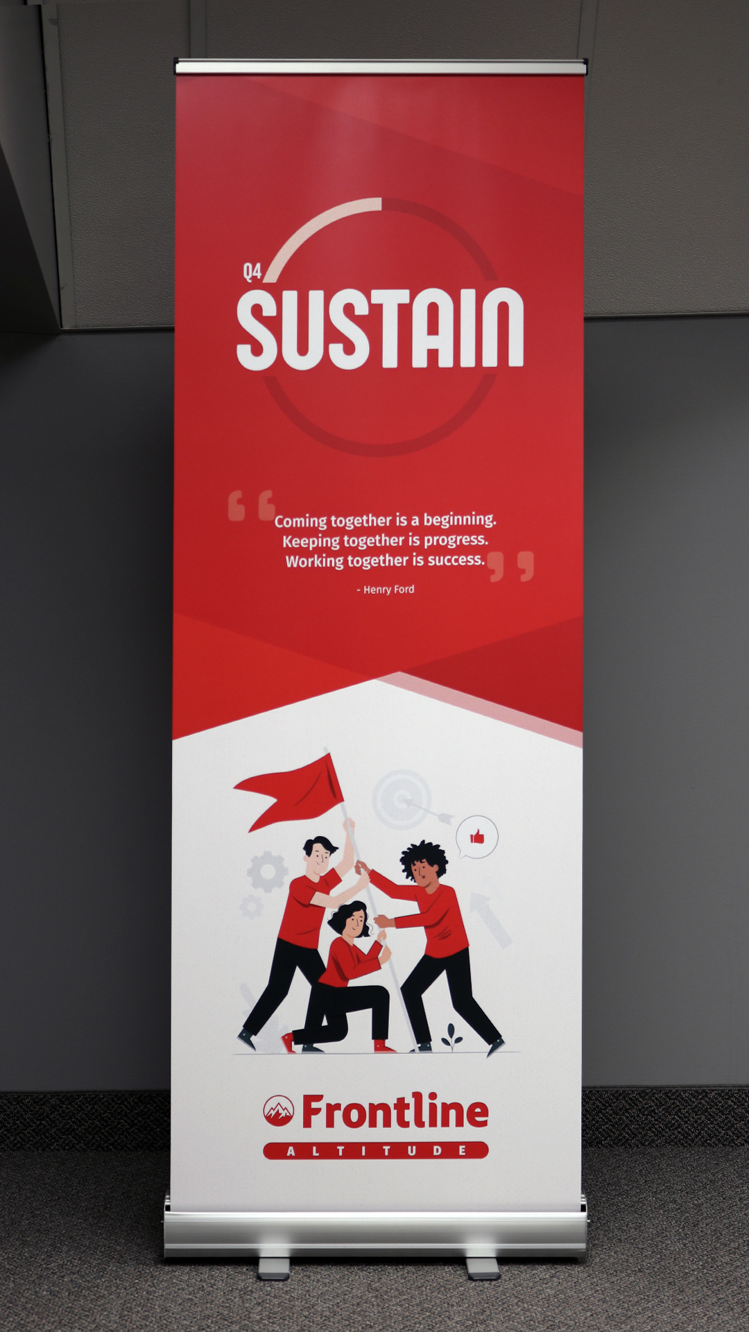
The second annual theme was ALTITUDE with the following quarterly sub-themes:
Q1) Embark
Q2) Climb
Q3) Soar
Q4) Sustain
Q2) Climb
Q3) Soar
Q4) Sustain
One comment I received about the ENERGY logo was "it was disappointing to never see the bar fully load" when we made it to the end of the year. I made sure to fix that on the new ALTITUDE logo.
I swapped the power button icon for a mountain range to represent ALTITUDE as a literal statement but also philosophically in the way of working as a team to climb the mountain (aka our annual goals).
To keep on theme, I created a new set of banner designs. Because these banners are 22" wide x 60" high, it can be difficult to find quality images, that are free for use, that are also large enough to print without becoming pixelated so I opted for vector graphics to illustrate the sub-theme.
