I've always been drawn to play with the word "bat" when creating my own content. I know we tend to stray from allowing clients to create their logos based on personal preferences, since sometimes it is completely unrelated to their brand. However, I felt in this case it was appropriate to pour every ounce of my personality into the design of my logo.
I pulled my inspiration for the bat from origami, a pastime I enjoyed challenging myself with when I was a kid. A rule I decided on during the process was to only use triangles, 3 points for sake of unity and simplicity. The symmetry of the geometric shapes genuinely makes me happy.
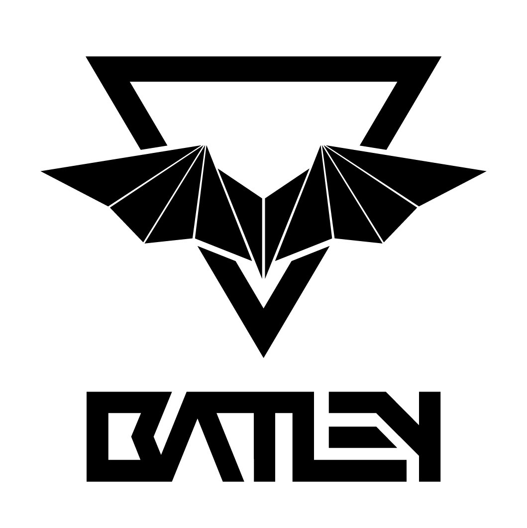
The overall bold design of my word mark and icon, were strongly inspired by brands such as The North Face, Honda, ESPN and a few others. I feel those brands have loud yet clean branding and distinct personality, with strong ties in their respective field.
Another small tidbit, I truly relate to being a Taurus (although I don't put much stock into astrology) therefore my element is Earth. You might notice in the shape and alignment of the triangle and the bat, it forms the simplistic Earth element. I enjoy hidden meanings, or inside jokes when it comes to logo design, so long as it compliments the overall outcome rather than hinder it.
-
I truly am, my own worst critic. It took me an extremely long time to get to where I am with this logo AND to be happy with the result. Many thanks to my family, and my co-workers, for continued support and feedback.
CREDITS